A few months back I was speaking with Sudheesh Nair, (@sudheenair on twitter) from Nuntaix about the slightly washed out look of the Nutanix Prism interface. Both myself and a colleague mentioned the interface was difficult to present on a large screen, something we’d been doing a bunch since installing Nutanix in our environment.
Sudheesh gave us the heads up on a hidden feature that enables the user to select “normal” or “high” contrast when using Google Chrome. It was in early stages of development and would drop in a later release.
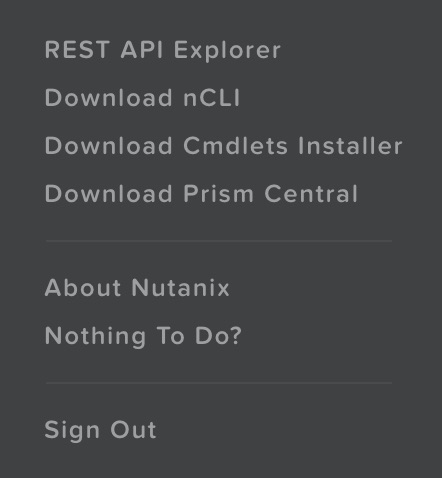
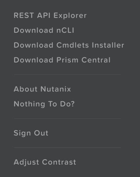
A few days back we performed a rolling upgrade from 4.0.2.2 to 4.1.1. The upgrade went through without issue so when I jumped into Chrome, first port of call was the contrast feature. I couldn’t remember the required key strokes so Cameron Stockwell (@ccstockwell) pointed me to KB 2021 which described the process. Turns out the key sequence is easy, Click Shift on the User Menu.
Standard Click on User Menu

Shift Click on User Menu
Click on Adjust Contrast and you’ll see the contrast box pop up at the bottom of the screen.
Of course there are other wonderful and no doubt more important features in this release, the hypervisor one click upgrade comes to mind, but for some reason I was looking forward to this one given the number of complaints I’d had from people when displaying it on a large HDTV.


